

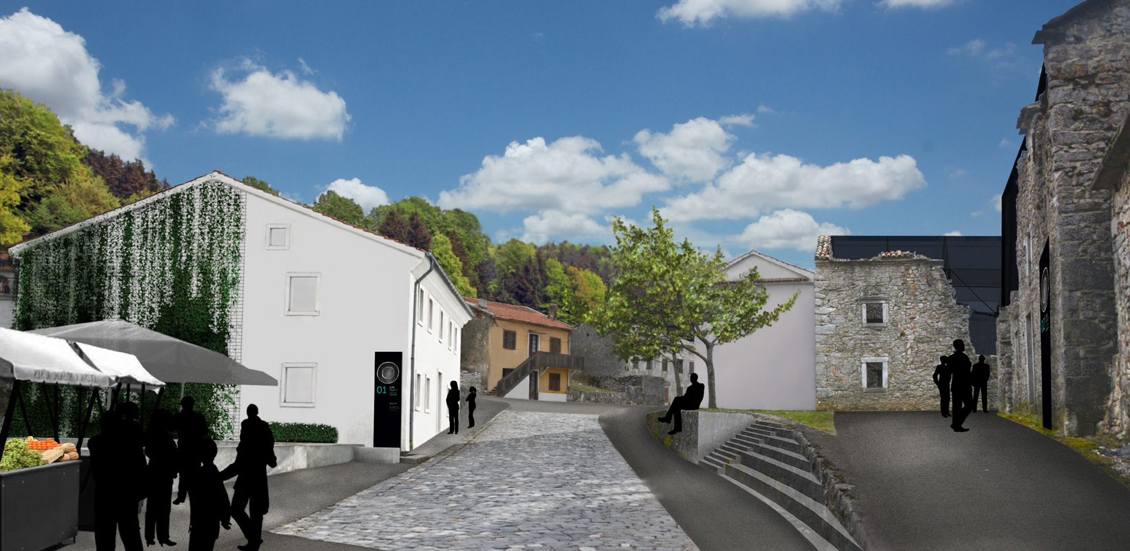
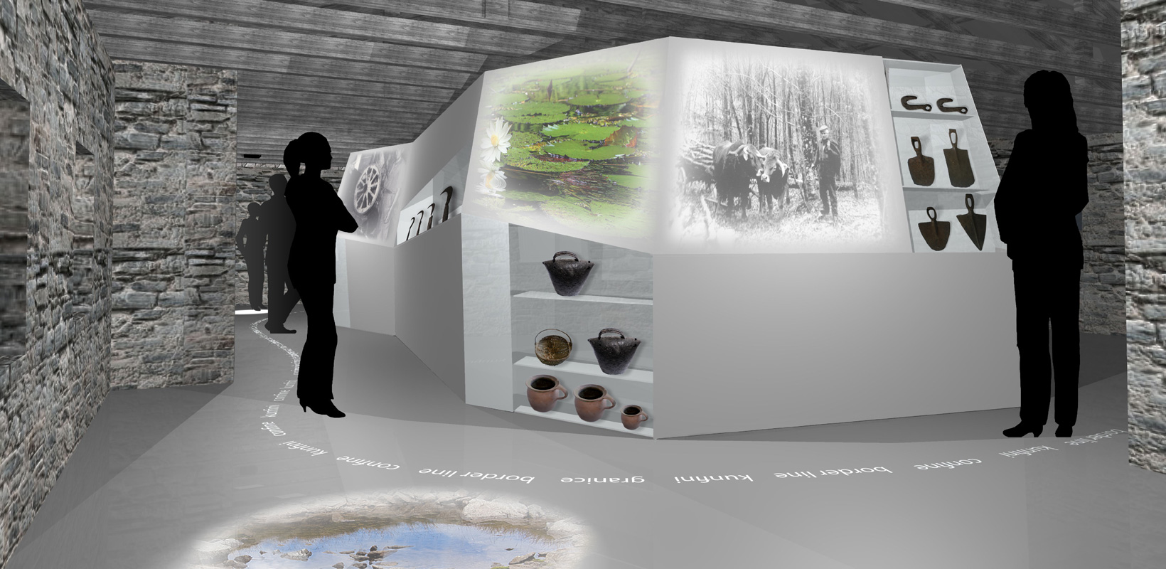
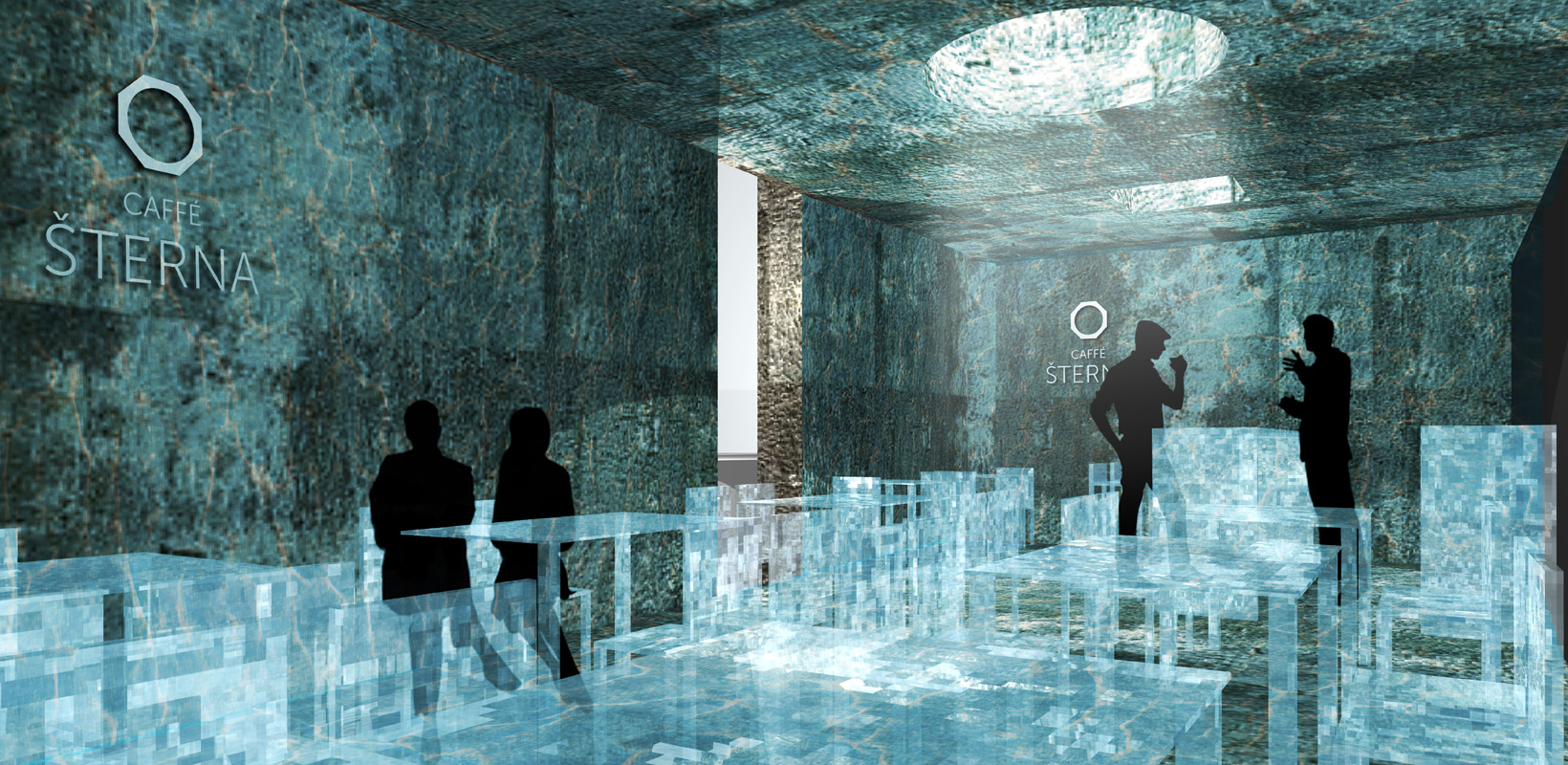


Visual identity, signage, exhibition concept, architectural design
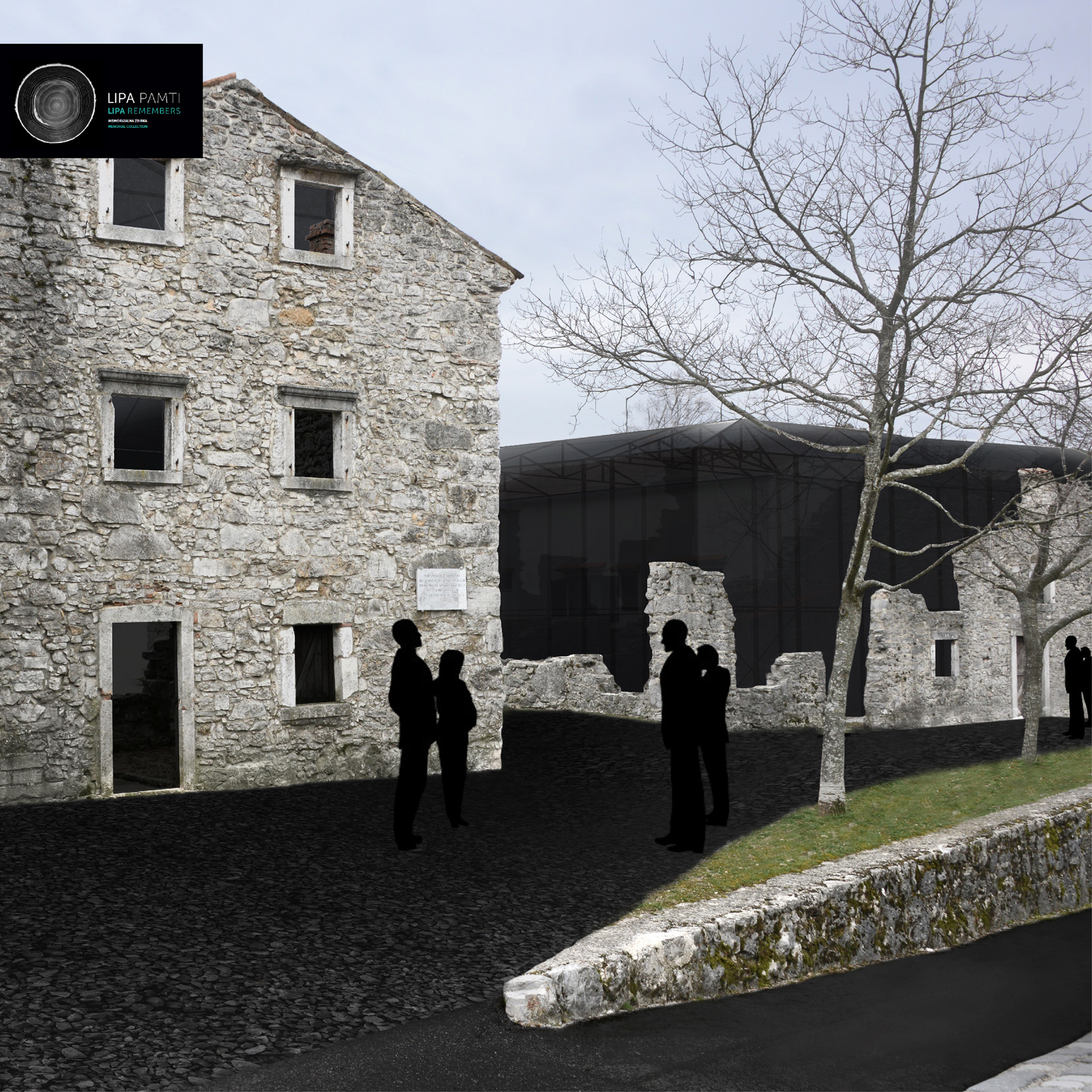
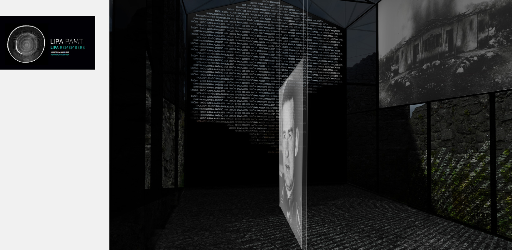
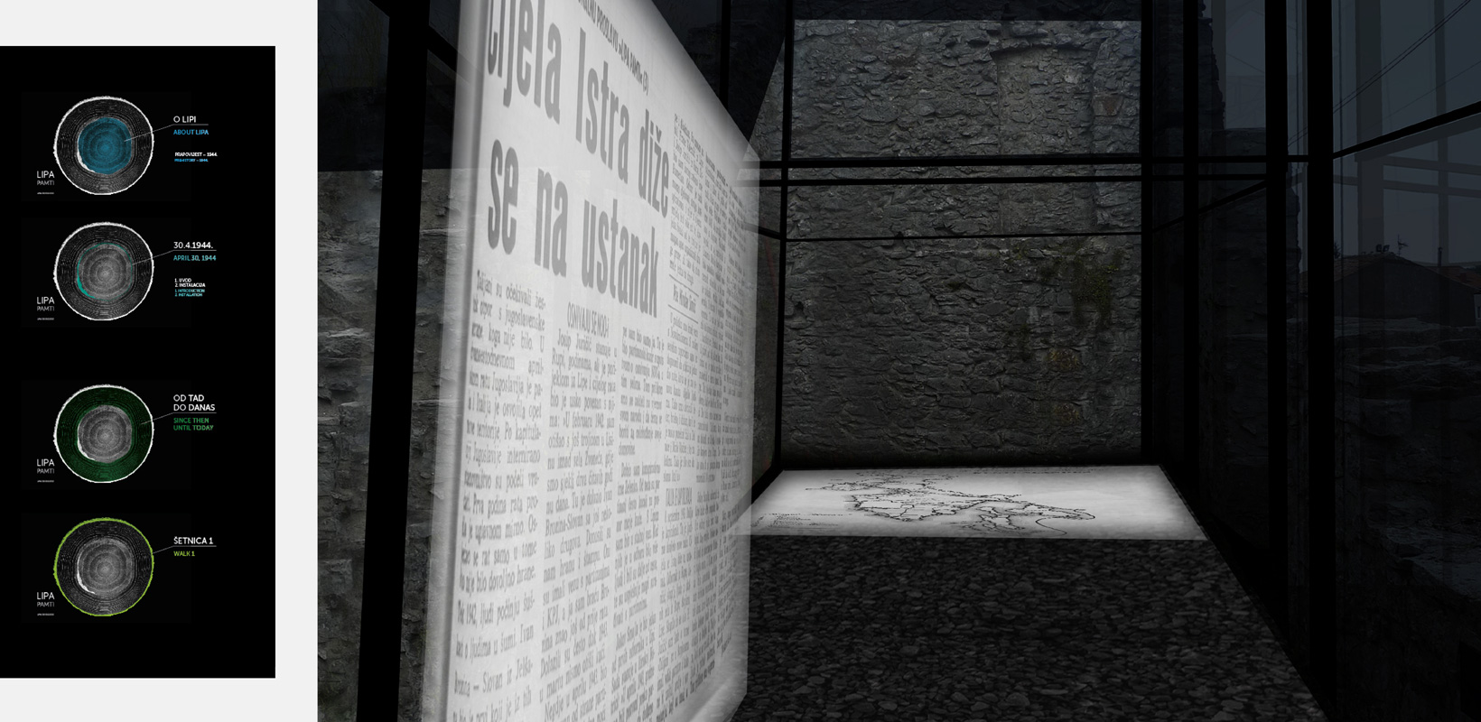
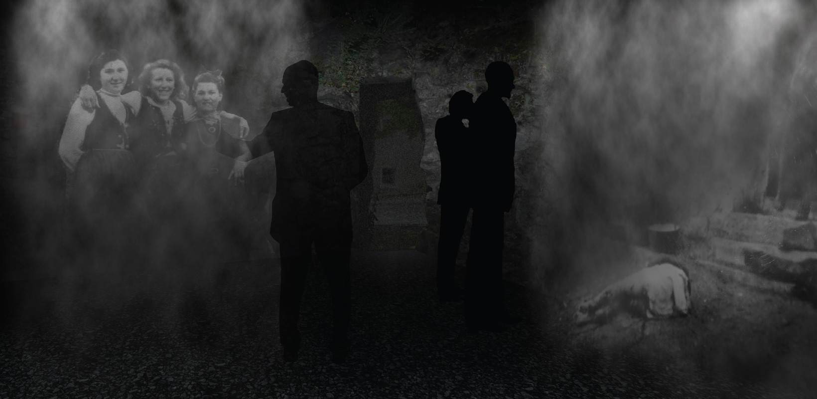
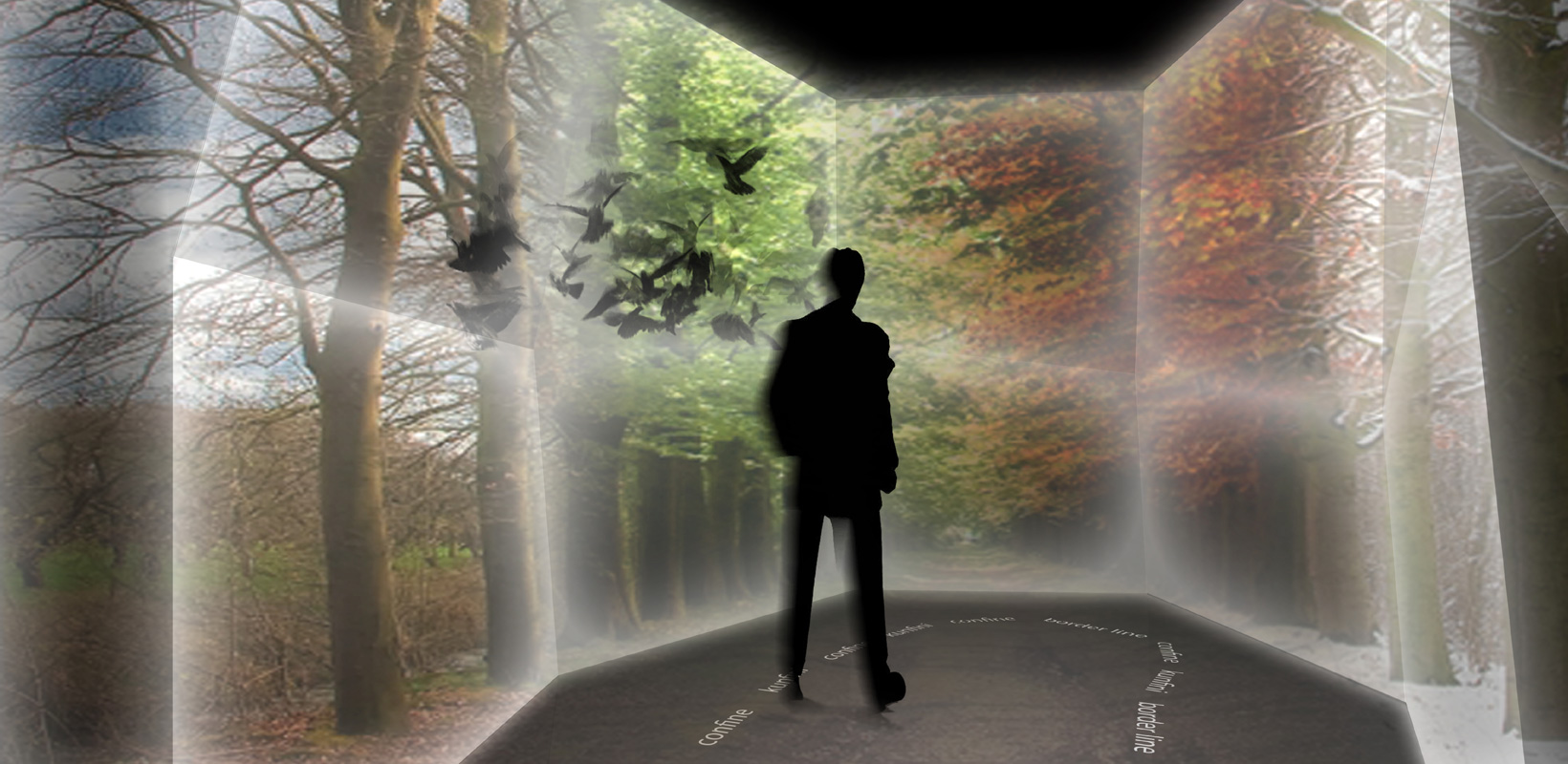
The tree remembers. In the cross section of each individual tree, its life story is written. The grains show which years was rainy, which was dry, while fires leaves a specific dark trail, a nearly black thickening along the edge. If it were possible to make an X-ray of a living tree, Lipa trees would tell us their story. The story of the village of Lipa is specific in that the only material evidence of the crimes is preserved in negatives at a photo shop in Slovenia, where German soldiers took their films to be developed. These two elements – a wood cross-section and a negative – make the basis for the visual identity of the Lipa Remembers Collection. The visual identity consists of signs, logos, colors and typography, but also of the concept of exhibition.
Jury explanation:
The brave and ambitious concept suggests transferring the main collection from the museum and is characterized by high levels of elaboration and a high degree of technological complexity. It is full of impressive elements from the exhibition which the jury deems worthy of further development in a later stage of the project. Visual identity, understandable and articulated.
Client: HDD competition
Project: Lipa remembers visual identity, signage, exhibiton concept, architectural design, details
Year: 2013
Concept and design: Ana Banić Göttlicher, Maša Vukmanović, Margita Grubiša, Ivana Žalac