

Visual identity & Branding / chain of bakeries
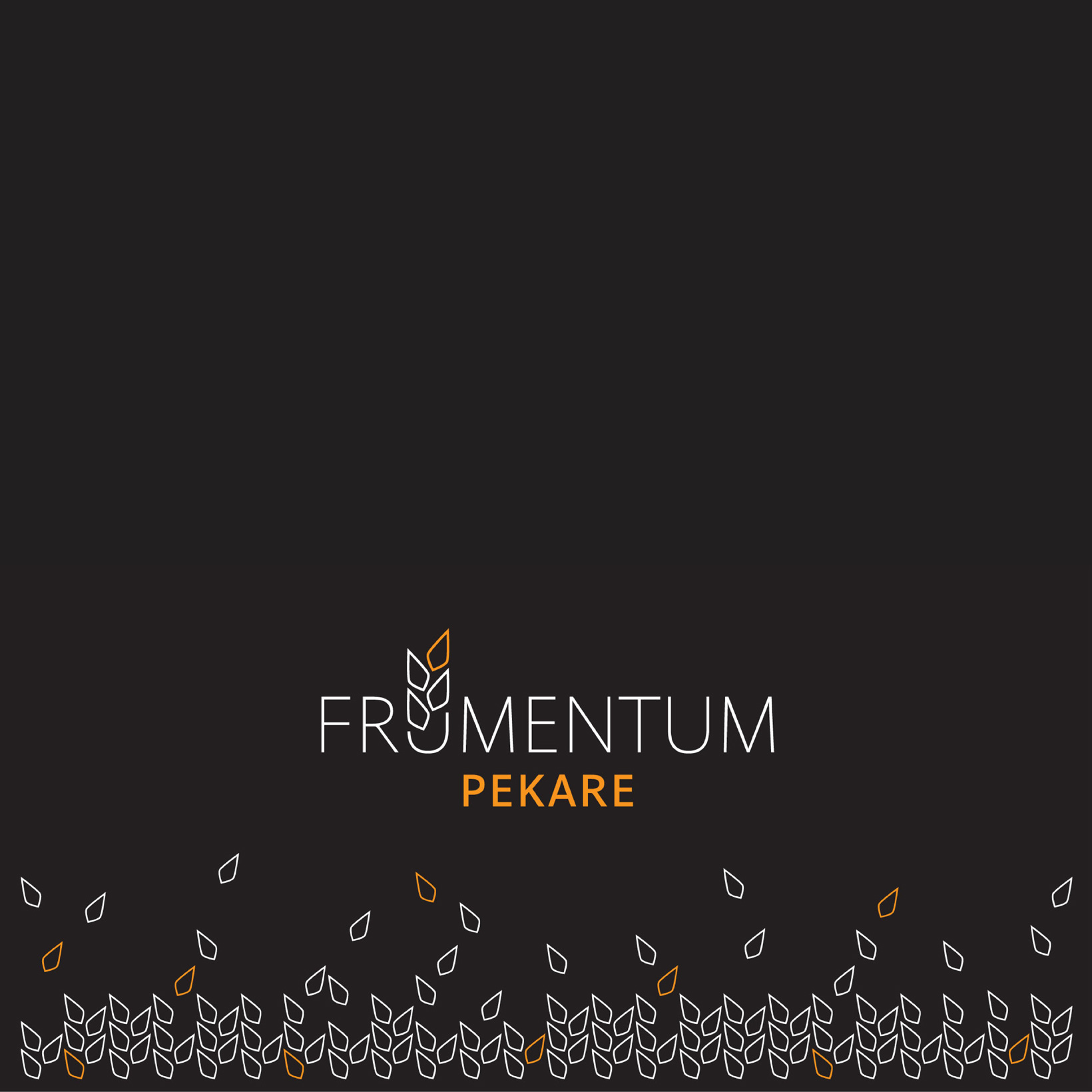
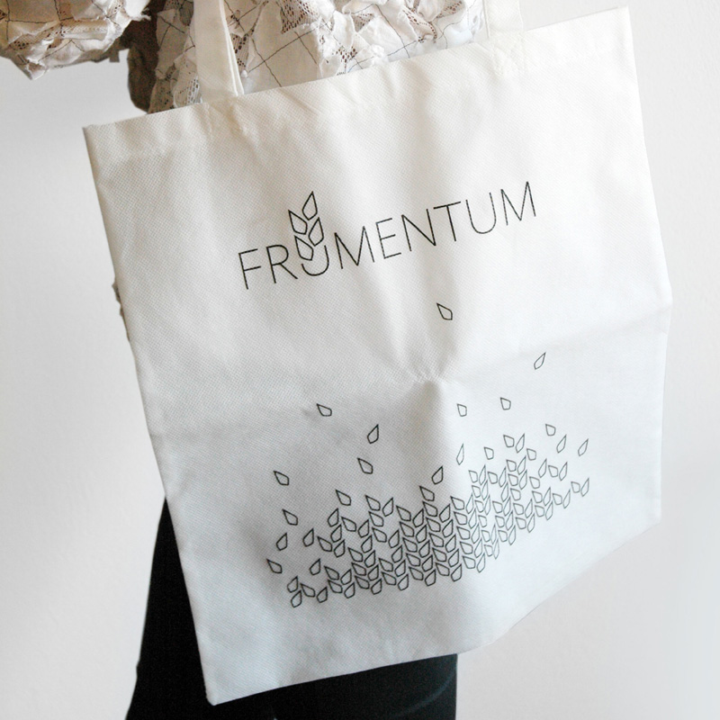
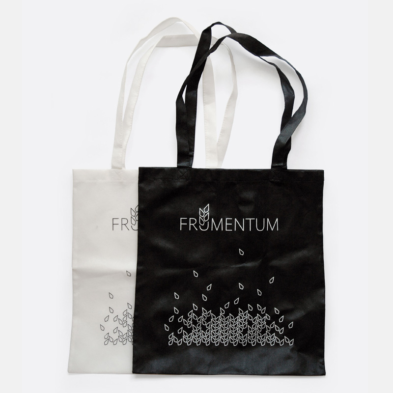
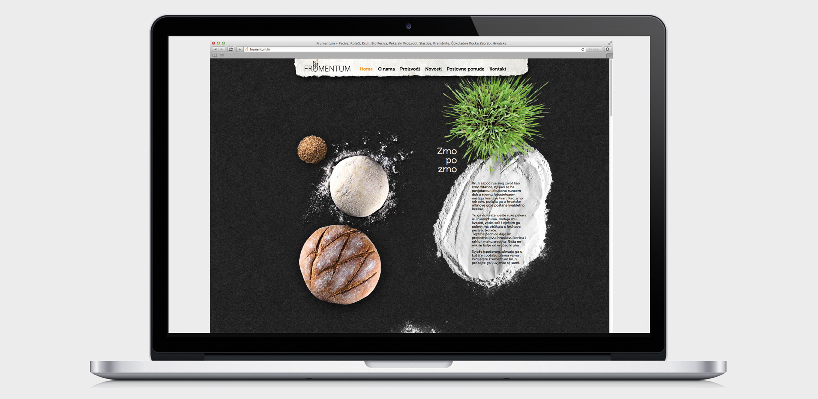
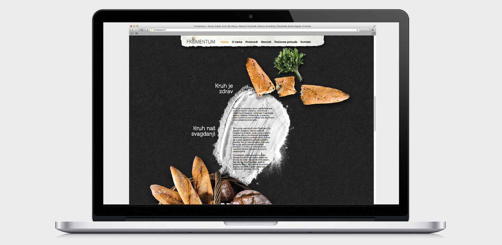
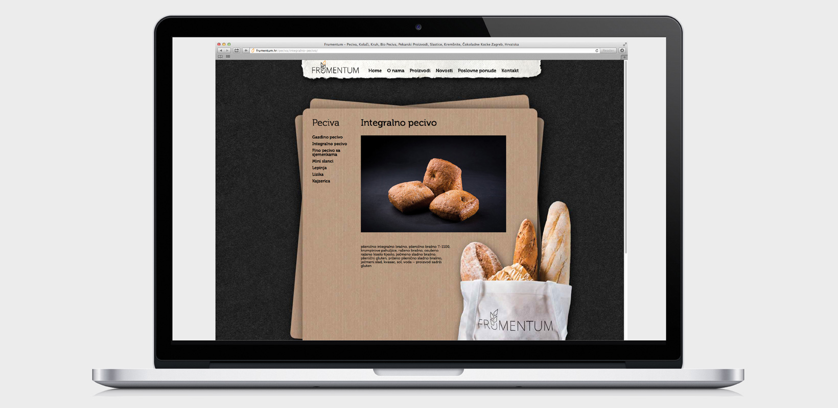
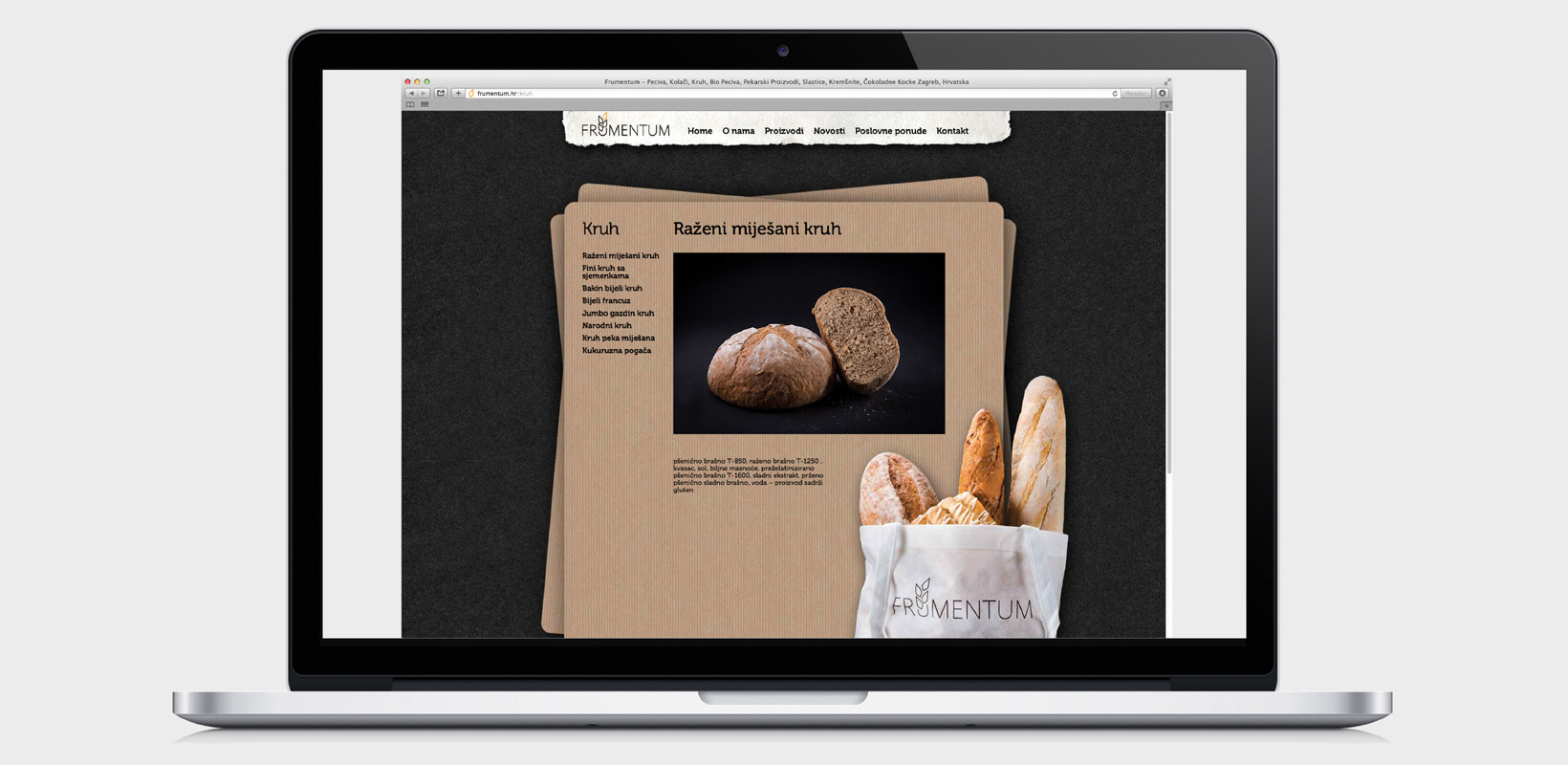
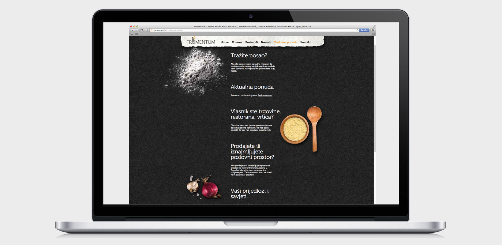
The idea for the Frumentum bakeries’ visual identity was based on the Latin meaning of the word “frumentum” – grain. The visual identity is fluent, warm and friendly. The grains inside the logo create a double association – one of produce on the plate, and the other, produce growing from the logo.
Wheat grains appear in different ways as a dominant visual. They are always linear, their composition recalling the field, a “field” from which the individual elements fly. Besides the logo and the sign, also designed were bags, posters, POS materials, web site, IBA Munich stand and sale points.
DESIGN EXHIBITIONS:
AMBIENTA / Zagreb 2013
1112 / exhibition of the HDD (Croatian Designers Association), Zagreb 2012
Client: Frumentum Ltd
Project 2D / grapchic / print / web: visual identity design, website design, sales venue design, packaging design
Year: 2011 – 2012
Concept and design: Ana Banić Göttlicher, Maša Vukmanović